For decades, the Blue Screen of Death (BSOD) has been a dreaded yet iconic part of the Windows experience. Appearing in the event of a serious system crash, it has become a symbol of disruption, failure, and frustration. But now, Microsoft is replacing the familiar blue screen with a new color and updated experience—and the timing couldn’t be more relevant.
A New Look for System Failures: Enter the Black Screen
Microsoft has officially announced a visual overhaul of its error-screen interface. In place of the classic blue background, users will now see a black screen when a critical system error occurs. While the technical information displayed remains similar—error codes, QR codes, and crash diagnostics—the change is more than cosmetic.
The decision to replace the blue screen with a black one aligns with Microsoft’s broader design philosophy under Windows 11. The black background is meant to blend better with the default dark theme, resulting in a more consistent visual experience. While this may not reduce the frustration of a crash, it certainly looks cleaner and less jarring.
Read More: YouTube’s New AI Search May Impact Creators as Google Shifts Strategy
The CrowdStrike Outage: A Real-World Test of System Stability
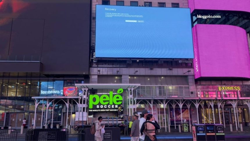
The shift in visual design comes shortly after one of the most widespread Windows-related outages in recent history. On July 19, 2024, a faulty update from cybersecurity firm CrowdStrike triggered system failures on over 8.5 million Windows devices. Businesses across industries—from global airlines to financial institutions, hospitals, and sports venues—were affected.
Images of the blue screen of death flooded social media, with photos going viral from places like Times Square, international airports, and even the New York Stock Exchange. These public displays underscored how deeply embedded Windows systems are in our daily infrastructure—and just how visible these failures can be.
Why the Change Now?
The BSOD has been a part of the Windows operating system since Windows 1.0. While its functionality has evolved, the blue background has largely remained unchanged—until now. There are several reasons Microsoft is making the switch:
- Modern Aesthetics: The black screen better aligns with Windows 11’s design language, which favors dark modes and cleaner interfaces.
- Reduced Visual Shock: Blue is bright and disruptive; black is subtler and easier on the eyes.
- User Experience Enhancement: The new screen design includes streamlined text and clearer diagnostics for IT teams.
The change may also symbolize Microsoft’s effort to shift user perception. Instead of highlighting system failure in bold blue, the black screen may serve as a softer, more professional approach to handling technical issues.
Key Differences Between Blue and Black Screens
- Feature Blue Screen (Legacy) Black Screen (Windows 11)
- Background Color Blue Black
- Error Details Technical codes + QR code Same, with updated typography
- System Version Windows XP to Windows 10 Windows 11 and newer
- Visual Impact Highly visible, jarring Sleeker, more subtle
- Public Perception Iconic but disruptive Modern and less alarming
How the Black Screen Will Improve IT Response
While the color change might seem superficial to casual users, it can significantly impact IT administrators and system analysts. Microsoft has introduced improved error messaging and more accessible diagnostics via QR codes, which link directly to Microsoft’s online support documentation.
This improvement is especially valuable in enterprise environments where downtime translates into significant financial losses. When a critical error occurs, faster troubleshooting and clarity in messaging are key to resolving issues efficiently.
The Cultural Legacy of the BSOD
The BSOD has long held a place in tech folklore. From Steve Ballmer joking about it on stage to its appearance on massive public displays, it became a symbol of both Windows’ dominance and its fallibility.
Despite its negative connotation, the BSOD was also an essential diagnostic tool. IT professionals learned to decipher its hexadecimal codes and cryptic messages to get systems running again. In a way, the blue screen was as much a part of computing history as the startup chime or the Ctrl+Alt+Del command.
Frequently Asked Questions
What is the Blue Screen of Death (BSOD)?
The BSOD is an error screen displayed after a fatal system crash in Windows. It indicates a hardware or software issue that the operating system cannot recover from without a reboot.
What replaces the BSOD in Windows 11?
Microsoft has replaced the blue background with a black screen, keeping most other information (like error codes and QR codes) the same.
Why did Microsoft make this change?
To create a more cohesive and less disruptive visual design that aligns with the Windows 11 dark theme and improves user experience.
Will the new black screen help solve crashes faster?
While it doesn’t directly prevent crashes, the black screen introduces clearer diagnostics and better links to online support, which may help IT teams respond more efficiently.
Can users customize the crash screen appearance?
No. The crash screen is a system-level interface and cannot be customized by end users.
Was the black screen involved in the CrowdStrike outage?
No, the CrowdStrike outage displayed the traditional BSOD because most affected systems were running Windows 10. The black screen appears only in Windows 11 and newer builds.
Will this change affect system performance or reliability?
No. The change is purely visual and does not impact how Windows handles errors or system performance.
Is this the end of BSOD memes and jokes?
Not quite. While the background has changed, users are still likely to refer to system crashes as “BSODs”—but perhaps with a new twist: the Black Screen of Doom.
Conclusion
The retirement of the Blue Screen of Death marks the end of an era for Microsoft. In its place, the sleek and modern black crash screen reflects not just a design change, but a shift in how Microsoft wants users to experience and interpret system failures.
While errors and crashes will never be welcome, the updated interface is a small but significant step toward a more modern, consistent, and user-friendly Windows environment. And in the wake of massive outages like the CrowdStrike incident, it’s clear that how a system fails—and how clearly it communicates that failure—matters more than ever.